Creating content
This user guide helps you to create content on your web pages. TYPO3 provides different content elements for this purpose.
Creating content element
- Switch to the Page module.
- Select the desired page in the page tree.
- In the working area, select the Columns view.
- You will now see a simplified representation of your page with the content areas Seiteninhalt (page content), Randinhalt (sidebar content) and Header (only home page).
- In each content area you can add new content elements via the Content button. Then select the type of content element you want.
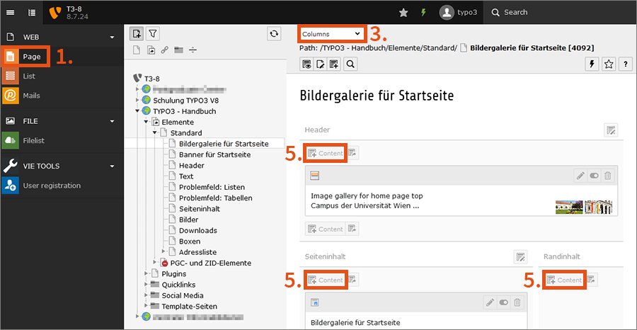
- Alternatively, you can create a content element using the corresponding button at the top of the working area.
- After clicking on the button, a panel opens in which you can select the desired type of content element.
- Drag the icon of the content element to the desired position on the page.
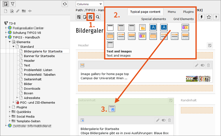
Selecting type of content element
TYPO3 offers a variety of different content elements. The following sections present the most important content elements.
In most cases, you will use the content element type Text and images. This is the most versatile and universally applicable content element type. With the content elements Image gallery and Banner for home page top, you can additionally design the home page.
You can see how the individual content elements look in the frontend, i.e. on the website, on the layout webpage.
Banner for home page top
You can only use this content element for your home page in the Header area. The home page is marked with a globe in the page tree at the front.
The banner contains:
- Image
- Title
- Description (optional)
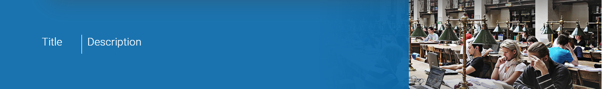
For the image, you require an image in widescreen format (about 670 × 175 pixel), as parts of the image will disappear behind the blue banner.
- To select the image file, click on the folder icon under Image.
- The filelist opens. You can select an image that has already been uploaded or upload a new image.
- The title and description are automatically taken from the properties of the image. If you want to overwrite this information, activate the checkbox under Title and Description (Caption). Then enter the appropriate text in the text fields below.
Image gallery for home page top
You can only use this content element for your home page in the Header area. The home page is marked with a globe in the page tree at the front.
Contrary to the banner, you can upload several images here, which will then appear alternately in an animation.
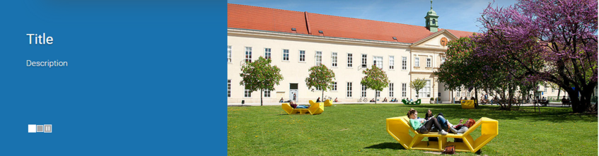
You can make the following settings in the Appearance tab:
- display only the image description or also the title of the image
- display transparent blue box with the text above the images or without transparency next to it
The optimal size of the images is:
- blue box above images: 1300 × 340 pixels
- blue box next to images: 806 × 340 pixels
Your images do not have to correspond to these dimensions exactly. However, the resolution should be high enough so that TYPO3 can convert the dimensions of the images accordingly. If your image dimensions are too small, you will see either white stripes or a pixelated version of the image.
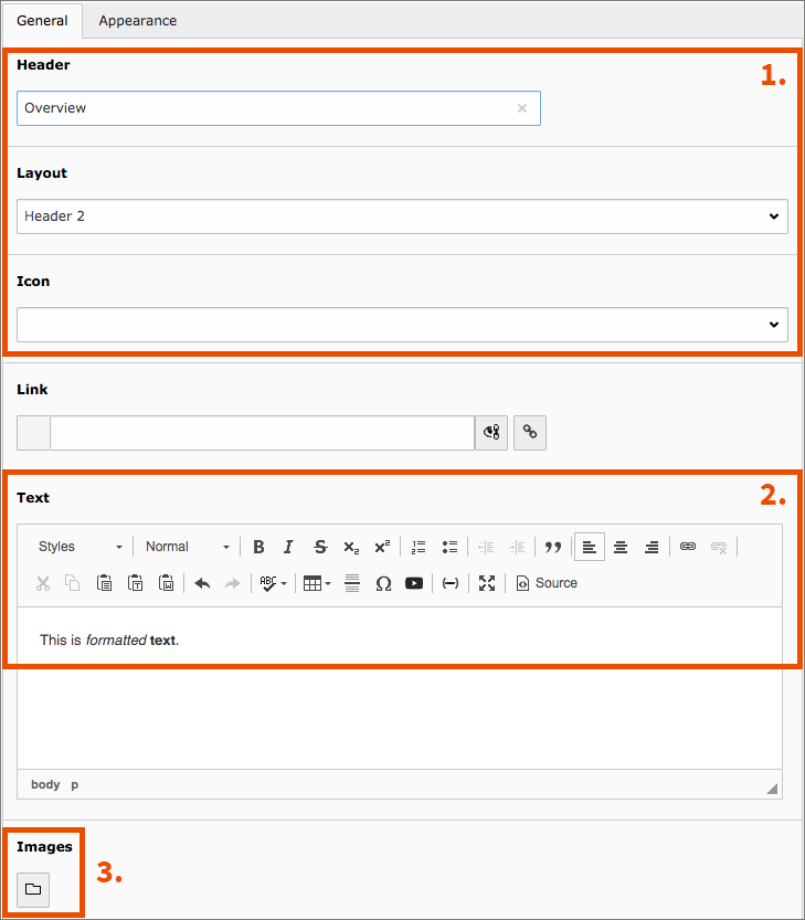
Text and images
The content element Text and images consists of 3 parts:
- Header: Enter the desired text and select the hierarchy level (header 1, header 2, etc.). Optionally, you can display a symbol next to the heading.
- Text: You create and edit the text in the so-called rich text editor, which enables simple text processing. You can use the buttons to format characters (such as bold, italic) or paragraphs (such as bullet lists, indentation).
- Image: Underneath the editor, you can find a button with a folder symbol. After clicking on this button, the filelist opens and you can select existing images or upload new images.
TYPO3 adjusts the size of the images to the device on which the web page is opened. You can therefore not influence the image dimension. Always upload images with a width of at least 900 pixels for optimal display.
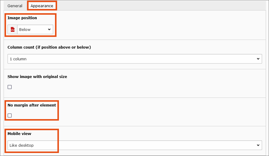
There are more options in the Appearance tab:
- Image position: adjust position of images (for instance, above, below, left or right of the text)
- No margin after element: eliminate the white space below an element (for several connected content elements)
- Mobile view: exempt content element or its images from the mobile version
Bullet list
The content element Bullet list allows you to create a simple bullet list. Simply enter every bullet point item in a separate line in the text field Bullet list.
In the drop-down Type of bullets, you can choose between the following bullets:
- Unordered list: blue squares
- Ordered list: numbered blue squares
In content elements with a rich text editor (such as Text and images) you can also create bullets and choose the background colour (grey, white or striped).
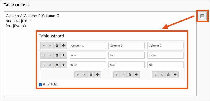
Table
The content element Table allows you to edit tables in a text field. Every line corresponds to a table row. Cells are separated using vertical lines (so called pipes: |). Press alt gr + < on your keyboard to create a pipe.
In addition, you can use the table wizard to add, erase or move rows and cells.
Note
If the icon for the table wizard is not displayed immediately, click Save once.
In the Appearance tab, you can make further settings for the layout, such as the number of table columns, the table style or the position of the table header.
Alternatively, you can create tables in the rich text editor.
Note
In accordance with Responsive Design, the tables adapt to the different widths of the respective end device. It therefore does not make sense to define fixed widths for columns.
Info box
The content element Info box is suitable, for example, for information you want to draw particular attention to. It consists of:
- Bar, several colours to choose from
- Header, several colours to choose from
- Text block, designable in the rich text editor
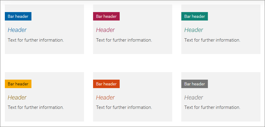
Image gallery
The content element Image gallery allows you to present several images in the same position and provide them with an image description. Users can browse through the gallery with two buttons on the left and right.
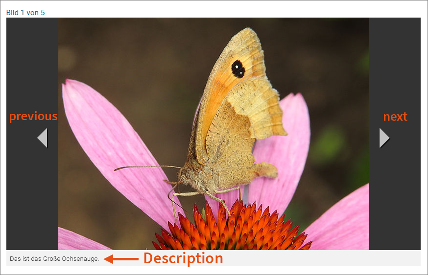
Upload all images in the same landscape format, with a minimum width of 900 pixels. Pictures in portrait format will be displayed with a grey area on their left and on their right. The user guide for adding images can be found in the section Banner for home page top.
File links
Using the File Links content element, you can offer one or several files for download in a blue download box.
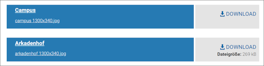
Selecting the files works the same as selecting images. However, the relevant button is called Add file. You can sort the files according to file name, file type, file extension and file size. You can hide the file size via a checkbox.
Insert records
With the Insert records content element (in the Special elements tab) you can display a content element on several pages by creating a link to the element to be displayed. In this way, you only have to change content that exists several times on the web page in one place. As soon as the cache is cleared, the link will also display the changed content.
Linked content elements are displayed in light blue in the backend.
Emergency banner
You can find this content element in the Special elements tab. It comprises fields for a header, text and related links. It appears before a flashy orange-red background and can be used in all content areas, including the header container on the home page.
Address list
The content element Address list displays a collection of addresses in a list. To include it on a page, the following steps are necessary:
- Creating data sets of the type Address
- Creating content element of the type Address list, that displays the data sets as a list
Creating data set of the type Address
- Switch to the List module in the Web module area on the left.
- If you would like to create multiple addresses, we recommend you to create a separate folder. Click on the left button above the page tree and drag the folder icon to the desired position.
- Click on the icon Create new record above the working area and select the item Address in the list.
- Fill in the first name and last name and the address data in the Contact tab and save the data record.
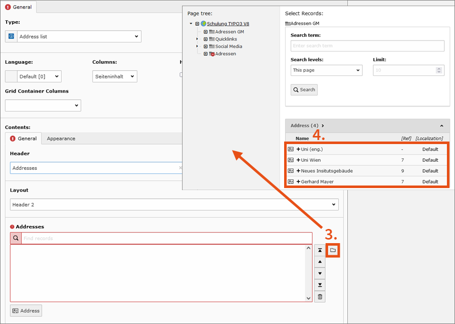
Creating content element of the type Address list
- In the Web module area on the left, switch to the Page module.
- Create a content element of the type Address list at the desired location. This is located in the Special elements tab.
- Under the layout settings for the heading there is a list field in which you select your addresses. To do this, click on the folder icon next to the field and navigate in the page tree that opens to the place where you previously created the address entry.
- Click on the name to transfer the entry to the list field.
- Under the tab Appearance you can define which fields of the address are to be displayed.
Note
For the presentation of personnel details on your website, you can use the separate plug-in Univie staff list. It creates an interface to the staff directory and allows you to create automatically generated lists of all employees at your organisational unit.
Address list for sidebar
The content element Address list for sidebar can only be used in the area Randinhalt (sidebar content). Selecting the addresses works in the same way as with the normal Address list.
If you check the box Do not show address from site information, the standard contact will not be displayed on the relevant page.
Plain HTML
If you enter HTML text using the Plain HTML content element, TYPO3 will output it without processing it any further. Only use this content element if you are familiar with HTML programming. You could otherwise impair the functionality of the page.
Note
Never make any changes to the University of Vienna’s Corporate Design. Do not add any additional CSS code to your HTML element. The TYPO3 service is available to you only in the given design.
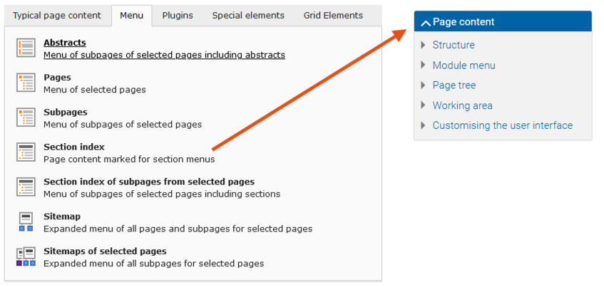
Menus
In the Menu tab you will find several navigation elements that you can use in the content area. Use these content elements sparingly. The design of the University of Vienna already contains a predefined menu with 4 levels that depicts the page tree. In addition, the complete sitemap is linked in the footer of each page. These standardised navigation elements should be sufficient for you and your website visitors in most cases.
Nevertheless, it sometimes makes sense to supplement these navigation options with content elements. At the beginning of the TYPO3 user guides, for example, you will almost always find an element called Page content. To create this, select the type Section index in the Menu tab. This navigation element lists all content elements of a page for which the checkbox Show in Section Menus is activated in the Access tab.
Grid elements
Grid elements allow you to add containers for columns. The content area will be divided into 2 or 3 columns in which you can insert content elements as usual.
To create a grid element: Click on Create new content element and select the Grid Elements tab. You have the following options for the grid:
- 2-column, split 50 % – 50 %
- 2-column, split 34 % – 66 %
- 2-column, split 66 % – 34 %
- 3-column, split 33 % – 33 % – 33 %
You can change the layout at any time later via the settings of the grid element. Headers you enter when creating grid elements will only appear in the backend.
Note
The columns will only appear in the desktop and tablet version. In the mobile version, the content will be displayed in a single column. Therefore, you should only use grid elements for contents that can theoretically also appear one below the other and not for tables.